
Global Accessibility Awareness Day 2025
Global Accessibility Awareness Day or GAAD falls on 15th of May this year (2025), and as always, there are many issues that we could discuss. It may surprise you to know that low-contrast text remains a common issue found on nearly 80% of pages.
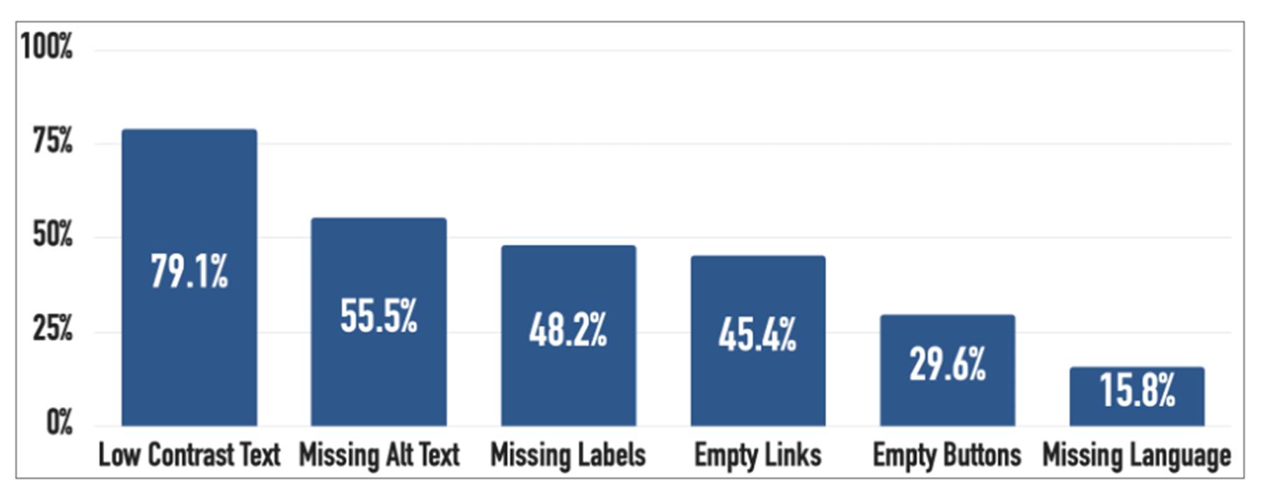
(Source WebAIM Million report 2025)
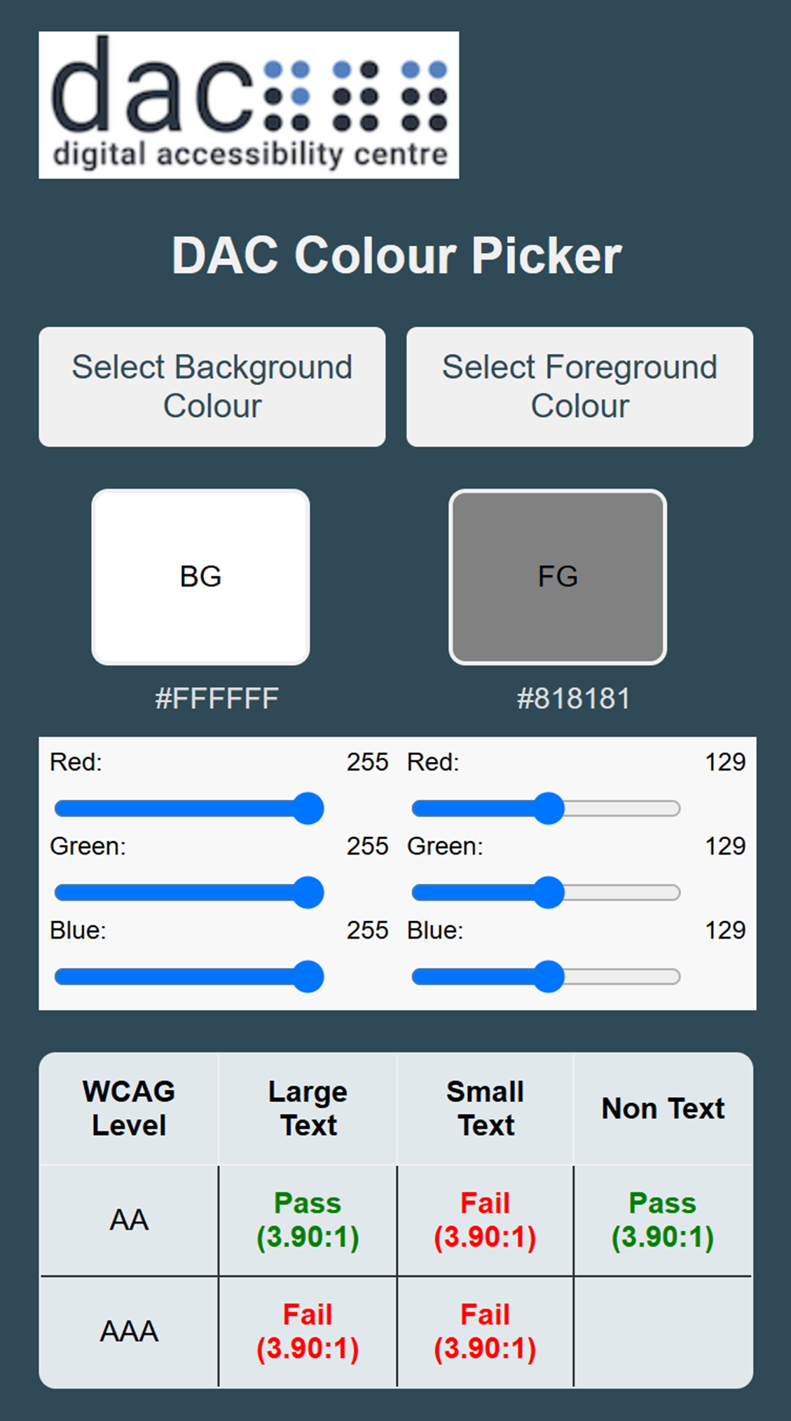
This is due in part to websites being designed with the aesthetics of the site as the most important consideration. One example of this is that grey text has become popular with designers but is causing problems for low vision users. Although the theory is that it is easier to read than black text on a white background, it is proving to be harder to make out and can easily fail WCAG colour contrast.
With over 2.2 billion people worldwide living with some form of vision impairment, just this one issue can have a widespread impact on users, and it is, for the most part, a preventable issue.
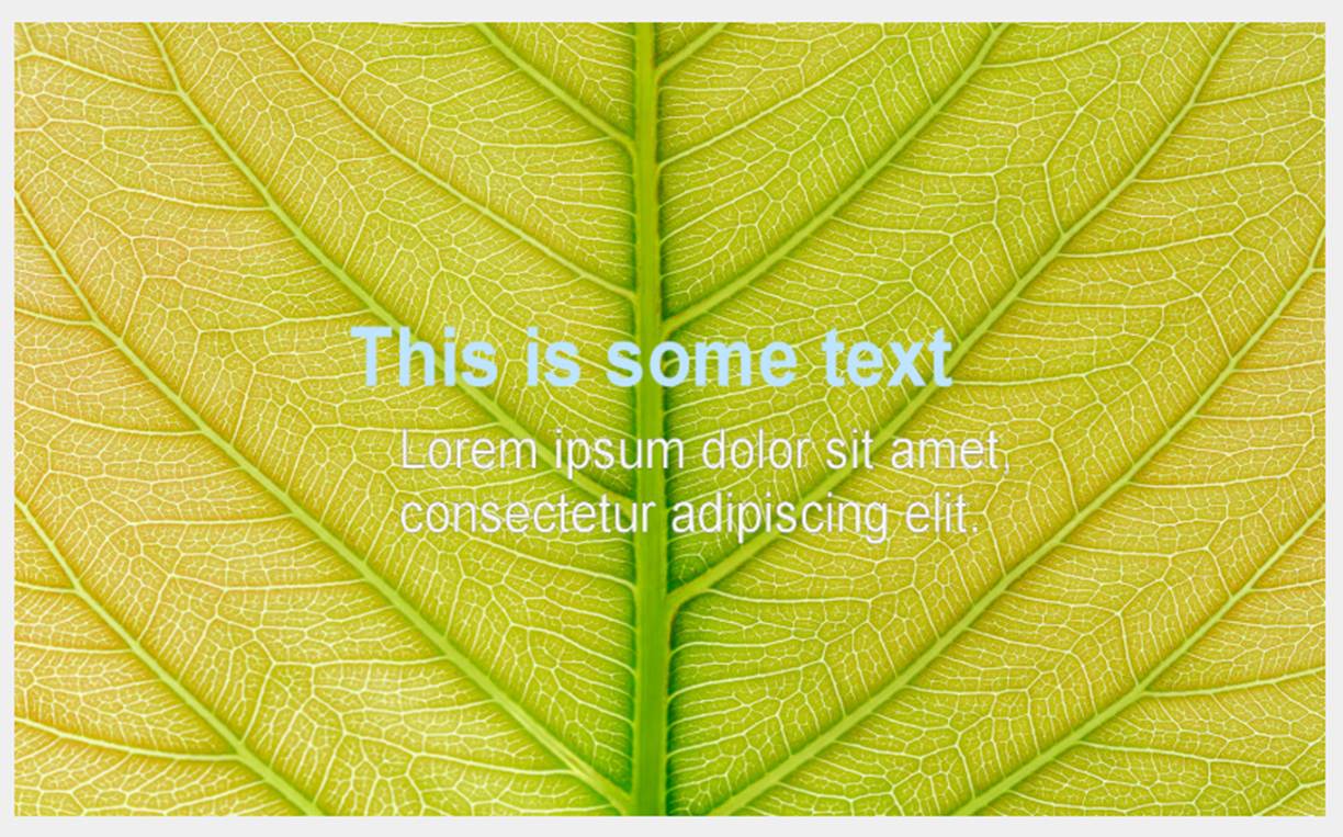
The choice of text colour coupled with patterned backgrounds can also make for a frustrating and confusing user experience. What may look enticing and vibrant can be a daunting prospect for low vision users.
This GAAD, we at the Digital Accessibility Centre (DAC) want to raise awareness of, and give some insight into, what could be one of the easiest issues to address, but also one that could make a significant impact on the accessibility of a website and the way in which users interact with it.
We asked some of our low vision analysts for their thoughts and experiences of low-contrast text. This is what they had to say about it:
“I find reading fatigue and headaches from eyestrain are a frequent occurrence when trying to use a website with low-contrast text. Placeholder text within form fields is a case in point as it is often too poorly contrasted to read easily if at all. Grey text has become more popular, and although it may look nice, it is difficult to read.”
“From a low vision users’ perspective, the success of a website relies heavily on the readability of the text; if the text falls below a certain colour contrast ratio, then readability is reduced, often to the extent that the text is no longer readable.”
“When I visit a website and find that the text contrast is below the WCAG standard, it is off-putting. If it is a site that I am visiting for personal use, outside of work, I will often go to a different site that is more accessible to me. There are things I can try, like inverting the colours on the screen, but that can be problematic as well because elements, like buttons, can disappear when inverting the colours.”
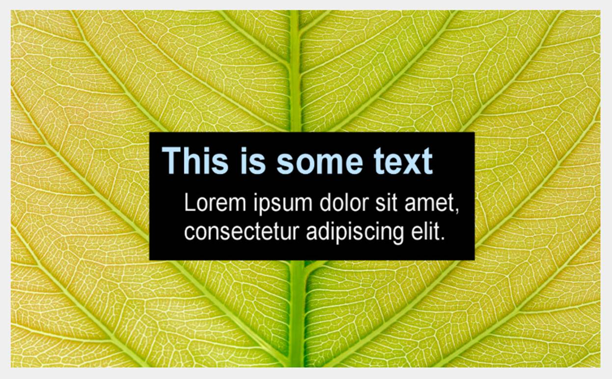
“Personally, I find text on different coloured or patterned backgrounds very difficult to read. The words merge with the background and become unreadable. One way of combatting this is to use a semi-transparent box in a contrasting colour behind the text but on top of the background. This provides enough contrast for the text to be more easily read.”
For this last issue, we can give an example of how making this small but notable change can help a low vision user to access information more easily.
By adding a box in a solid colour that contrasts with the text background, we can improve the readability of the text and make it easier for users of all abilities to access information.
To find out more about what we do at DAC visit us at Digital Accessibility Centre
Because everyone matters.